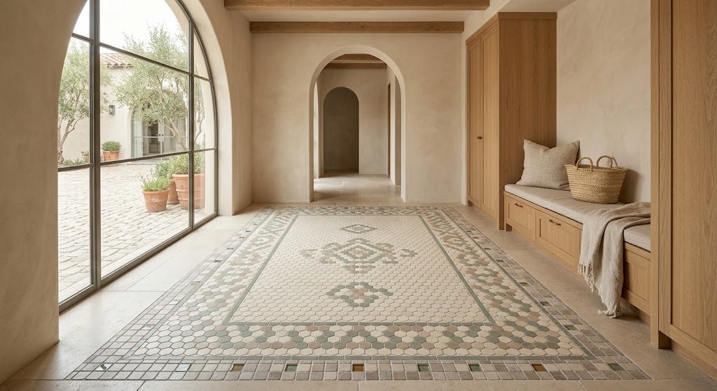
Every surface in a room contributes to its mood, but the floor does more work than most. It’s the first thing your eye registers from a doorway and the last thing your feet feel underfoot. When that surface combines multiple shapes and materials deliberately, something remarkable happens—the room gains a sense of depth that single-format installations rarely achieve.
The tile industry has evolved considerably in the past decade. Monochromatic, single-format floors still hold their place, but there’s a growing appetite for surfaces with more personality and dimension. Homeowners and designers alike are exploring what becomes possible when you layer different shapes, finishes, and textures into a unified composition.
The challenge, naturally, is control. Variety without clear direction spirals into visual chaos. What follows are the principles that keep eclectic floor compositions grounded and purposeful.
The Value of Introducing Contrast
Uniform tile installations deliver consistency and calm. They also tend to flatten a room’s character over time. Everything blends together, and nothing stands out.
Introducing a second or third format disrupts that sameness in productive ways. When different geometries and finishes coexist on the same plane, the floor acquires visual rhythm—a sense of movement that keeps the eye engaged without fatiguing it.
There’s a navigational dimension as well. In open-plan layouts, a shift from one tile format to another can define where a kitchen ends and a living area begins. These transitions guide movement instinctively and give a home a sense of considered architecture.
Rule 1: Establish a Tight Color Foundation
All successful mixed-material floors begin with the same first move: color discipline. Limit yourself to two or three tones before touching a single sample board.
Warm neutrals—cream, warm taupe, soft gray—create the most versatile foundation. They absorb variation in shape and material without introducing visual friction. Bolder accents layered on top of this kind of backdrop gain definition and purpose.
What you’re actually doing is allowing shape and texture to generate the variety while color stays consistent. Muted earth tones and warm grays are particularly forgiving, blending easily with tiles that carry more personality or color. This restraint is what prevents an eclectic composition from looking unplanned.
Cool palettes—pale blue, soft charcoal, white—follow the same logic. The narrow the range, the freer each element becomes to express its own character.
Rule 2: Build a Clear Visual Hierarchy
When every tile on the floor carries equal visual weight, nothing reads as intentional. Hierarchy solves this problem by assigning distinct roles to each format.
The dominant tile covers most of the surface—large, neutral, unassuming. It performs the essential work of grounding the entire scheme. A secondary tile introduces more personality through pattern, color, or smaller scale. A third element—the accent—delivers a small but powerful focal detail.
Apply the familiar 60-30-10 distribution that designers use across all scales of interior work. The dominant tile occupies roughly sixty percent, the secondary fills thirty, and the accent claims the remaining ten. This ratio prevents any one element from overwhelming the others.
Chalky whites, muted clays, and soft earth tones make ideal base layers. Their quiet presence allows everything above them to register clearly.
Rule 3: Pair Shapes That Create Productive Tension
Hexagons, squares, rectangles, triangles, diamonds—each geometric form brings its own visual energy. The art lies in choosing combinations that generate contrast without conflict.
A proven approach uses hexagons as the primary field, particularly in entryways and bathrooms, framed by a square-tile border. The difference in geometry creates a natural perimeter—comparable to the way an area rug anchors furniture within an open room.
Keeping color constant while shifting shape is another technique with broad appeal. Two tiles in the same tone but different forms let the grout lines become the dominant pattern. The effect is understated and remarkably adaptable.
You can also introduce organic curves alongside linear geometries to break visual monotony. A rounded element placed near angular ones creates a tension that energizes the surface without tipping into disorder.
Rule 4: Manipulate Scale to Control Attention
Proportion is one of the most underestimated tools in tile design. It directs the eye quietly but powerfully.
Large-format tiles establish breadth and calm. Smaller pieces—mosaics, compact hexagons, penny rounds—create concentrated points of visual interest. Balancing both within a single installation gives you precise control over where attention lands.
Consider the relationship between wall and floor surfaces as well. If the floor features small, detailed work, larger formats on the walls create equilibrium. Reverse the pairing and the same balance holds.
Two practical rules prevent scale mixing from going wrong. Change one attribute at a time—if sizes differ, keep the finish consistent. If finishes differ, keep the format the same. Many people overlook how helpful a physical visit to a ceramic tile shop can be for understanding these scale relationships hands-on. Holding samples against each other in actual room light removes the uncertainty that digital images create.
Rule 5: Blend Materials Through What They Share
The most captivating floors draw from more than one material family. Ceramic, stone, glass, and porcelain each bring distinct qualities—weight, warmth, reflectivity, texture—and combining them opens possibilities that a single material cannot reach.
Glass mosaic accents set within a porcelain field introduce shimmer and chromatic depth. Concrete-effect surfaces paired with brick-look tiles produce an industrial warmth. Natural stone laid adjacent to wood-look porcelain bridges organic warmth with contemporary precision.
The essential requirement is a unifying thread. Color, finish, sheen, or undertone—something must connect these diverse materials into a coherent family. Without that thread, the mix reads as arbitrary.
Mosaic floor tiles drawn from different material categories benefit enormously from this shared connection. A terracotta wall element shares warmth with a limestone floor. A fishscale detail in a shower niche echoes the undertones found in the broader palette. The relationship might rest on something as subtle as a matching matte quality or a parallel warm cast.
Browse any well-organized ceramic tile shop and you’ll notice how the strongest displays connect disparate products through invisible qualities—an undertone, a finish family, a textural kinship. Seek out those connections deliberately.
Rule 6: Deploy Borders as Structural Anchors
Borders aren’t decorative extras. They serve as architectural elements that impose order on complex compositions.
A defined perimeter border contains the visual activity of a busy field. It gives the eye a place to rest at the edges and creates a sense of completeness around the room’s circumference.
Transitional strips perform similar work between zones. A single course of brick-format tile separating two larger fields marks a change in the floor’s language without any jarring shift. In open-plan settings, these transitions accomplish spatially what walls would accomplish structurally.
Borders also simplify installation by reducing the number of cuts needed along the perimeter. The practical benefit reinforces the aesthetic one—cleaner edges produce a more polished result overall.
Rule 7: Let Patterned Zones Stand Alone
Pattern and plain surface depend on each other for their respective impact. A room full of pattern feels claustrophobic; a room devoid of pattern feels sterile.
Restrict your most decorative work to a defined area—a feature wall, an inset on the floor, a shower alcove. Let that section carry the complexity while everything around it stays calm.
A bold backsplash mosaic gains presence when the floor uses large, monochromatic tiles. The quiet surroundings amplify the pattern’s authority rather than diluting it. The same principle applies to floor-level focal points: a detailed inset framed by broad, plain formats reads as a deliberate centerpiece.
Concentrating ornamental work ensures that patterned elements function as destinations within the room rather than competing layers of visual noise.
Practical Considerations
A handful of decisions made before installation begins will determine how the finished floor reads in daily life.
Grout selection deserves more attention than it typically receives. Joint color and width reshape the impression a floor makes—dark grout sharpens every edge while tone-matched grout softens the overall grid. Neither approach is inherently better; the choice depends on the mood you’re after.
Always evaluate physical samples in the actual space. Showroom lighting creates conditions that residential environments rarely replicate. Lay samples side by side, observe them across different times of day, and give yourself several days before deciding.
Have your installer map the complete layout before any tile is cut. Grout-line alignment across different formats is one of the most consequential details in the entire project. Ask your ceramic tile shop for recommendations on installers experienced with multi-format work—their familiarity with layout planning makes a measurable difference.
Scale the project to the room’s dimensions. Generous spaces handle bold, large-scale patterns with ease. Tighter rooms benefit from restraint—a micro-pattern in one section, or a single accent band, is often more effective than spreading complexity across every surface.
Closing
An eclectic mosaic floor is not a random assembly. It is a series of interconnected decisions about color, shape, scale, material, and boundary—each one reinforcing the others.
Narrow your palette. Assign roles. Mix geometries deliberately. Balance scale across surfaces. Connect materials through shared qualities. Use borders to create structure. Give patterned areas room to breathe.
When these principles guide every choice, the finished floor settles into the architecture with quiet authority. It doesn’t announce itself—it belongs. And that sense of belonging is the ultimate measure of a floor designed with genuine care.