Initially, the selection of tile colour seems almost incidental. Slowly, comprehension grows that this choice will blanket your floors, climb your walls, and often define entire bathing spaces. Unlike painted surfaces that submit to easy renewal, tile represents significant permanence. This lasting quality warrants far greater consideration than simply adopting whatever currently dominates social media feeds.
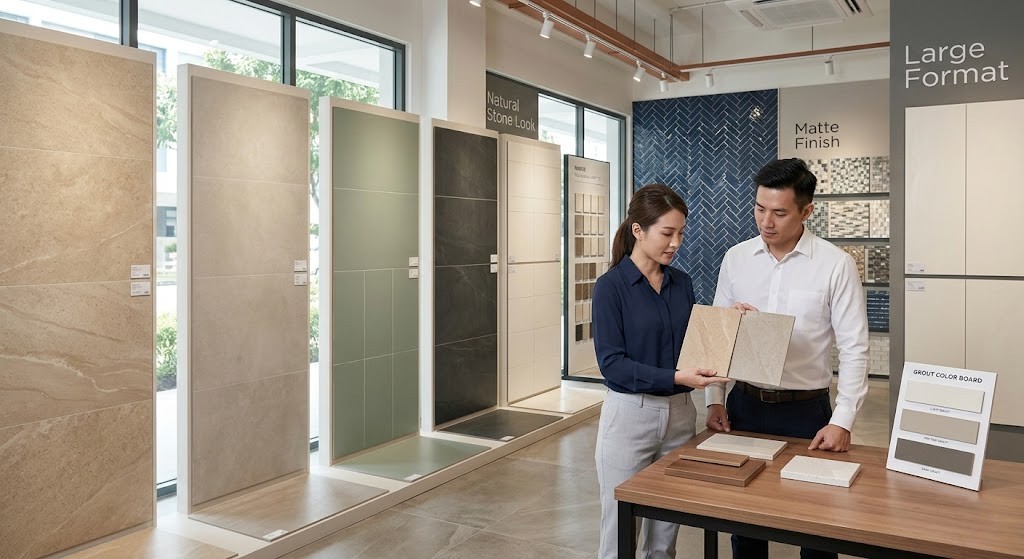
When walking into a ceramic tile shop, most customers immediately gravitate toward trending styles. This reaction is entirely expected. However, the most successful renovations balance three crucial factors: the emotional influence of colour, current design directions, and timeless appeal that survives passing fads.
How colour shapes mood in a space
Colour exerts immediate influence over how we perceive space. Light tones bounce illumination around, creating feelings of airiness. In Singapore’s notoriously compact apartments and small bathrooms, this effect is transformative. Soft cream, pale grey, and warm sand can make tight quarters feel surprisingly open.
Dark colours build depth and atmosphere. Rich charcoal or deep navy feel grounded and luxurious. Yet in small rooms with limited windows, these same colours can make the space feel closed in.
Warm hues like butter yellow, soft taupe, or muted terracotta create inviting environments. Cooler shades feel fresh and orderly. Neither is right or wrong; it depends entirely on the feeling you want to live with daily.
Before deciding, take time to picture the room at different hours. Morning sun has a different quality than evening lamplight. A colour that feels peaceful at noon might feel chilly at night.
Light behaves differently at home than in a showroom
Tiles look their best under showroom conditions. The lighting is perfectly even and the displays are artfully arranged. Your home cannot replicate this.
Many Singapore homes receive strong, direct sunlight during the day. At night, warm ceiling lights shift the colour again. Shiny tiles reflect light one way, matte tiles another. Even humidity can change how colours look, especially in bathrooms.
Always bring samples home. Lay them on the floor. Lean them against your cabinets. View them in daylight and under your own lights. A tile that looked perfectly neutral at the tile shop in Singapore might show surprising undertones in your actual space.
This simple step saves you from expensive mistakes.
Trends right now: softer, warmer, more natural
Trends tell us what people are collectively seeking. Lately, there has been a clear move away from cold, grey tones with blue undertones. Warmer neutrals are now everywhere. Think of colours like sand, greige, and soft stone.
Natural-looking finishes are also in demand. Tiles that mimic stone with slight variations. Matte surfaces preferred over glossy ones. Soft greens and blues used as accents rather than covering whole rooms.
These choices show a hunger for calm and comfort. After years of sharp contrasts and bright white, many people want their homes to feel softer and more welcoming.
There is nothing wrong with following trends. Just remember they change. What looks fresh today may look dated in a few years.
Why neutral is often the safest long-term choice
Neutral tiles do not demand attention. That is exactly why they work so well.
A neutral floor allows you to change your furniture, cabinets, and wall colours over time. If you sell your home, neutral flooring appeals to the widest range of buyers.
But neutral does not mean boring white. It could be textured beige with natural movement. Or warm grey with subtle variation. When you visit a ceramic tile shop, look for tiles with gentle shifts in tone. They add interest without locking you into a strong colour statement.
When bold colours make sense
Strong colours work best when used thoughtfully.
A deep green wall in the bathroom. A navy blue kitchen backsplash. A patterned tile in a small powder room. These choices add personality without taking over the whole house.
Keep large areas like main floors more conservative. Smaller spaces can handle bolder colours because they are easier to change later. Think of bold tile as you would a piece of art. It should add to the room, not overpower it.
Undertones: the quiet detail that matters most
Undertones are what make a tile choice succeed or fail.
Two beige tiles may look almost the same, but one might pull pink while the other pulls yellow. Put the wrong one next to your cabinets and something will feel off, even if you cannot say why.
Bring samples of your cabinets, countertops, or paint to the tile shop in Singapore. Compare undertones directly. Look for colours that work together, not necessarily ones that match exactly.
This small effort prevents big problems.
Grout changes everything
Grout is more than just filler. It changes how the tile colour reads.
Matching grout creates a smooth, continuous surface. Contrasting grout emphasizes the shape of each tile and creates a stronger pattern. For floors, mid-tone grout usually ages better than very light or very dark choices.
When you are choosing tiles, ask to see them with different grout colours. This easy change can completely alter the final look.
Timeless colours that rarely date
Some colours have remained popular for decades because they adapt so well. Soft off-white. Warm grey. Natural stone tones. Gentle terracotta. Muted charcoal.
These colours work with any style. Modern, traditional, minimalist, or eclectic. They do not tie you to one particular era.
If you are unsure, choose a timeless base and express yourself through accessories, paint, or fixtures that are easier to change.
Think about maintenance, not just appearance
Very light tiles show every bit of dirt and water mark. Very dark tiles show dust and streaks. Mid-range tones usually hide daily wear best.
In kitchens and bathrooms, this matters a great deal. Pick a colour that fits your cleaning habits and lifestyle. A beautiful tile that always looks dirty will not stay beautiful in your eyes for long.
This is worth discussing honestly when you visit a ceramic tile shop. Practical advice beats a pretty display every time.
Final thought
Tile colour is both an emotional and a practical decision. It affects mood, light, upkeep, and home value. It shapes how your home feels long after the work is done.
Trends can inspire. Psychology can guide. But comfort should have the final word.
Take your time. Test samples at home. Think about undertones and grout. Consider how the colour fits your daily life.
The right tile colour does not just look good on the day it is installed. It continues to feel right for years to come. That lasting satisfaction is what truly counts.