Some spaces are remembered because they have something that feels different. It might be an interesting wall, a distinctive colour combination, a memorable logo, or a small decorative detail that catches attention as soon as someone enters.
Lighting can play an important role in creating that impression. While conventional lights are mainly selected to illuminate a room, personalised lighting can also become part of the visual identity of the space. This is where Custom Neon Lights can offer a practical and creative option.
A personalised illuminated sign can be built around a name, phrase, logo, symbol, or original idea. It can be used in a home, office, shop, café, studio, reception area, entertainment room, or event setting.
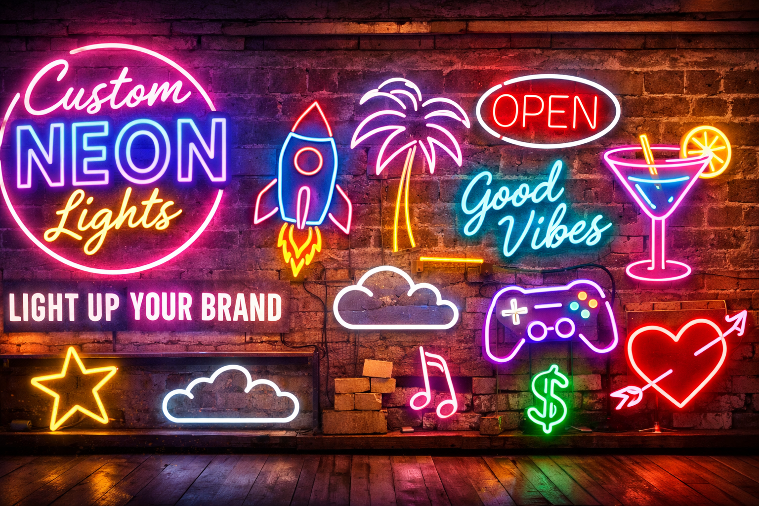
The most effective designs are not necessarily the brightest ones. They stand out because they are appropriate for their surroundings, easy to understand, and thoughtfully positioned.
What Makes Personalised Lighting Noticeable?
People naturally notice contrast and unusual visual elements.
A plain wall may go unnoticed, while a carefully designed illuminated sign immediately creates a point of interest. The glow draws attention, but the design gives people a reason to look at it.
This combination can make personalised neon lights useful for both decorative and practical purposes.
A custom design can:
- Highlight an important area
- Make a blank wall more interesting
- Reinforce a personal identity
- Support business branding
- Create a memorable backdrop
- Add colour to a neutral interior
- Give visitors something recognisable to associate with a space
The key is to create a sign that fits naturally into the environment rather than simply adding another bright object.
Start With a Clear Purpose
Before choosing a design, decide what you want the lighting to accomplish.
For a home, the purpose may simply be personal expression.
For a business, it may be branding or creating a recognisable customer area.
For an event, it may be creating a memorable backdrop.
These different goals require different approaches.
A bedroom sign can be decorative and subtle. A shop sign may need to be readable from several metres away. An event design may need to look particularly good in photographs.
Understanding the purpose first helps you make better choices about every other part of the design.
Make a Name Part of the Space
Names are among the simplest ways to personalise an illuminated design.
A family name can become a feature in a living room. Initials can work well in a bedroom or home office. A child’s name can add personality to a private room.
Businesses can also use their names as illuminated wall features.
The advantage of using a name is that it usually remains relevant for a long time. Unlike temporary decorative trends, a simple personalised name can continue to suit a space even after the furniture or colour scheme changes.
Short Phrases Can Create Strong Visual Impact
A long sentence is not always necessary.
A short phrase can communicate an idea quickly and remain easy to read from a distance.
Depending on the environment, the message could be:
- Motivational
- Humorous
- Romantic
- Professional
- Creative
- Inspirational
- Brand-focused
When selecting wording, think about how it will look as a physical design rather than just how it sounds.
Long phrases require more width and may reduce readability.
Shorter wording generally gives the designer greater flexibility with typography and placement.
Typography Can Define the Personality
The lettering style can completely change the character of a sign.
Elegant script can create a softer and more personal appearance.
Bold lettering can feel modern and confident.
Minimal typography can work well in professional interiors.
Playful lettering may suit entertainment rooms, cafés, or children’s spaces.
However, style should never come at the cost of readability.
A font that looks attractive in a small digital preview may become difficult to understand once the letters are illuminated and viewed from several metres away.
Always consider both appearance and practical readability.
Use Colour to Create Contrast
Colour is one of the easiest ways to make personalised lighting stand out.
A bright colour against a dark wall can create strong visual contrast.
A softer shade may blend more naturally into a neutral interior.
For businesses, colour can also be coordinated with existing branding.
For homes, the choice can be based on furniture, wall paint, artwork, and the mood you want to create.
Before deciding on a colour, consider the surrounding lighting as well.
A sign can look very different under natural daylight compared with a darker evening environment.
Give an Empty Wall a Purpose
Many rooms contain walls that are difficult to decorate.
They may be too narrow for large artwork or too open for a small decorative object.
A personalised illuminated sign can give such a wall a clear purpose.
Instead of filling the entire area, choose a design that occupies an appropriate amount of space.
Leave enough empty area around it so that the sign remains visually distinct.
This approach can make the wall look designed rather than simply decorated.
Make Business Spaces More Recognisable
Businesses often need to create environments that customers can remember.
A custom logo or business name can become part of that experience.
A café might place its sign behind a popular seating area. A salon can use its name on a feature wall. A boutique can create a branded corner near the entrance. A studio can use an illuminated logo as a background for photographs.
The sign then becomes more than decoration.
It becomes part of the business environment and can help create a consistent visual identity.
Reception Areas and Waiting Spaces
Reception areas are another natural location for personalised lighting.
Visitors often spend a few moments waiting, making a clear visual feature useful.
A business name, logo, or short statement can make the space feel more finished.
When designing for a professional environment, avoid overly complicated shapes or excessive brightness.
The sign should complement the surroundings and remain easy to read.
Create Better Photo and Video Backgrounds
Modern spaces are frequently photographed.
Customers take pictures in cafés and shops. Businesses record social media content. Families photograph their homes and celebrations.
This means an attractive illuminated wall can become part of the visual content created in that space.
When planning a sign, think about likely camera positions.
Consider whether people will stand directly in front of it, whether the sign will appear behind a seating area, and whether nearby mirrors or glass surfaces could create reflections.
Testing the lighting with a smartphone camera can be surprisingly useful.
Personalised Lighting for Entertainment Areas
Entertainment spaces can be more expressive than formal rooms.
Gaming rooms, music spaces, home theatres, and hobby areas are suitable places for creative designs.
A gaming setup might use a username or gaming symbol.
A music room could feature a musical phrase or icon.
A home theatre could use a cinema-inspired design.
Here, stronger colours and more playful typography can work well because the overall environment is already intended to be visually engaging.
Do Not Compete With Everything Else
One common mistake with decorative lighting is trying to make every element stand out.
If a room already contains colourful artwork, LED strips, patterned furniture, illuminated screens, and decorative objects, adding a very bright sign may make the space feel chaotic.
Instead, decide which element should be the main focal point.
If the custom neon lights is intended to stand out, allow the surrounding décor to remain comparatively restrained.
This gives the lighting room to attract attention naturally.
Size Should Match the Environment
A sign should be sized according to the wall and viewing distance.
A small design may be perfect above a desk but ineffective on a large commercial wall.
Likewise, a very large sign may overwhelm a compact bedroom.
Measure the installation area before finalising the design.
Also consider the furniture below or beside the sign.
The relationship between the sign and nearby objects can have a major effect on how balanced the final installation looks.
Brightness Needs to Be Comfortable
Being noticeable does not mean being excessively bright.
A bedroom may require softer illumination, while a commercial space may need stronger visibility.
If the sign is too bright, it can become distracting.
If it is too dim, it may lose its intended impact.
Adjustable brightness can be useful where the environment changes throughout the day.
It also helps when the sign needs to appear differently for normal use, photographs, or evening gatherings.
Plan the Installation Carefully
A well-designed sign can still look untidy if the installation is poorly planned.
Before mounting, check:
- Wall condition
- Mounting method
- Power access
- Cable routing
- Viewing angles
- Nearby furniture
- Maintenance access
Cable management deserves particular attention.
A clean wall with an exposed cable running across it can reduce the overall visual quality.
For commercial installations, secure mounting is especially important because the sign may be exposed to frequent customer activity.
Think About Long-Term Relevance
Personalised lighting is often purchased with the intention of keeping it for several years.
Therefore, consider whether the design will remain suitable as the space changes.
A simple name, logo, or timeless phrase can remain useful even when furniture is replaced.
A design based heavily on a short-lived trend may eventually feel dated.
This does not mean every sign needs to be completely neutral. It simply means that personalisation and long-term practicality should be considered together.
Care and Maintenance
Regular care can help preserve the appearance of illuminated signs.
Follow the manufacturer’s cleaning instructions and use suitable materials to remove dust.
Avoid harsh chemicals or abrasive cleaning tools.
Keep indoor installations away from unnecessary moisture.
Periodically check visible cables, connectors, and mounting points.
If the sign begins flickering or shows other unusual electrical behaviour, it should be inspected rather than continued in use without checking the cause.
Mistakes That Can Reduce the Impact
Before ordering Custom Neon Lights, keep a few common mistakes in mind.
Avoid:
- Choosing a design without measuring
- Using excessive wording
- Selecting an unreadable font
- Ignoring the wall colour
- Choosing excessive brightness
- Forgetting cable placement
- Placing the sign too close to other décor
- Ignoring camera angles
- Using too many illuminated features
- Selecting a design that does not suit its intended purpose
A few minutes of planning can make a significant difference to the finished result.
Final Thoughts
Custom Neon Lights can give a space a visual identity that standard décor cannot always provide. A personalised name can make a home feel more individual, while a business logo can become part of the customer experience. A short phrase or creative symbol can also transform an ordinary wall into a recognisable feature.
The strongest designs are usually the ones that balance personality with practicality. Consider the message, typography, colour, size, brightness, viewing distance, installation, and surrounding décor before making the final decision.
When choosing neon lights, think beyond the initial visual impression. Consider how the sign will look during the day, how it will appear at night, how people will photograph it, and whether the design will remain useful as the space evolves.
With the right planning, personalised lighting can do more than make a wall brighter. It can communicate an idea, reinforce an identity, create a memorable atmosphere, and give a room or business a detail that people naturally notice and remember.