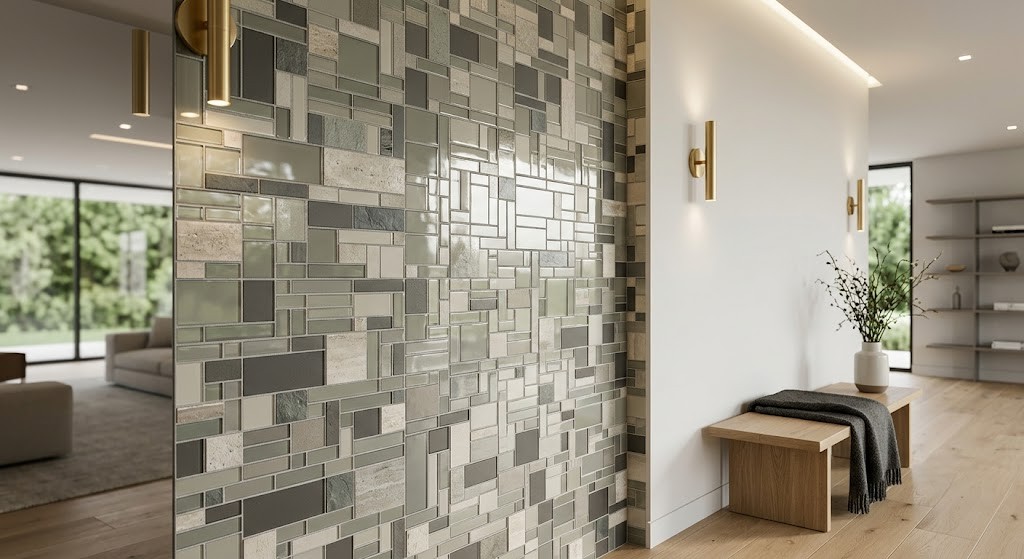
Walk through any standard home and you will notice a pattern. Walls are smooth and painted. Countertops are polished to a uniform sheen. Floors stretch in unbroken planes from one end of a room to the other. Functionally, everything works. Visually, much of it falls flat.
The root cause is simple. Modern construction favors large, uninterrupted surfaces because they are efficient to produce and install. But efficiency does not equate to visual richness. A room full of flat planes reads as incomplete, even when every finish is well chosen.
Small-format interlocking surfaces offer a direct remedy. Their inherent variation — multiple pieces, multiple joints, multiple reflections — introduces the kind of visual complexity that plain surfaces lack. Here is a practical look at how to use them effectively.
The Science Behind Visual Depth
Every perception of depth on a flat surface is an illusion. The brain reads visual cues — contrast, shadow, pattern repetition — and interprets them as three-dimensional form. Several specific mechanisms make this possible.
Grout networks are foundational. Where a single large-format panel presents one continuous surface, an arrangement of smaller pieces surrounded by joint lines forces the eye to process information in fragments. Each fragment demands its own moment of attention. The sum of these micro-pauses creates a layered reading that feels dimensional.
Reflection variation strengthens the effect. When a single sheet includes both glossy and matte pieces, the glossy elements catch incoming light while the matte elements absorb it. This tonal range creates the visual contrast typically associated with uneven surfaces. The brain interprets that contrast as relief, even though the physical plane is uniform.
Physical protrusion provides the most literal form of dimensionality. Products featuring pebble profiles, stacked cubes, or rough-cut stone extend beyond the wall surface. When lit from an angle, they cast genuine shadows that leave no doubt about their tactile presence. These dimensional options transform an optical trick into something you can feel.
Selecting the Right Material for Your Situation
Material choice shapes everything — the degree of visual impact, the maintenance requirements, and the overall atmosphere of the finished space.
Glass offers the most dramatic light interaction with the smoothest physical profile. Its surface catches reflections from multiple angles, causing its appearance to shift continuously as daylight moves. A glass installation near a window becomes a living element, never quite the same from one hour to the next. This dynamism suits kitchens, bathrooms, and other spaces with generous natural light.
Ceramic and porcelain provide broader surface variety. Manufacturers produce these with crackle finishes, subtle undulations, and raised relief patterns. They handle moisture gracefully and resist staining. Before selecting a specific product, spend time at a ceramic tile shop where you can physically examine different finishes. The tactile difference between a crackle-glazed surface and a smooth glazed one is immediately apparent when you touch it — something no photograph can replicate.
Natural stone — slate, marble, and travertine — delivers organic irregularity. Mineral veining, surface clefts, and natural cavities mean that no two pieces look alike. The resulting surface feels authentic and grounded. Stone works especially well in minimalist settings where the material itself is the focal point, such as a fireplace surround or a standalone accent wall.
Where to Apply Them for the Best Results
Concentrated application almost always outperforms comprehensive coverage. Targeted placement creates purposeful focal points that anchor a room’s composition.
Kitchen Backsplash Bands
The horizontal strip between countertop and wall cabinets sits at natural eye level. Filling this band with textured, small-format pieces breaks up what would otherwise be a monotonous stretch. For maximum visual interest, combine different finishes within the same sheet — frosted glass alongside polished, for instance — to create shifting patterns of light and shadow across the surface.
Bathroom Niche Framing and Accent Stripes
Bathrooms contain expansive flat surfaces that benefit from deliberate interruption. Framing a shower niche with a contrasting material immediately establishes a focal point within the enclosure. Another effective technique involves running a continuous horizontal stripe at eye level around the room. This adds visual detail while subtly widening the feel of a narrow space.
Lower Wall Cladding on Feature Walls
A bare accent wall in a living or dining area can feel unresolved. Covering the lower half in a textured material — stone, ceramic, or mixed media — establishes a strong visual base. The painted upper half remains simple by contrast. The dividing line between the two treatments gives the wall a sense of architectural depth.
Floor Insets and Decorative Borders
Flat floor treatments are practical but visually monotonous. Insetting a decorative motif into a field of larger-format tiles creates an instant focal point. The change in piece size and grout density signals a distinct layer, giving the floor plane a sense of intentional design rather than mere utility.
Installation Choices That Influence Perception
How you put these surfaces together has as much impact on the final result as which materials you choose. Several decisions during installation deserve careful attention.
Grout color is a surprisingly powerful variable. When the joint color closely matches the piece color, the surface reads as a unified, subtly textured field. When the joint color contrasts sharply with the pieces, the grid becomes a prominent design element. Comparing these options in person at a ceramic tile shop — ideally against sample boards — reveals how dramatically this single choice changes the finished appearance.
Orientation of the pattern shapes spatial perception. Most sheets arrive as square grids, but running bond, herringbone, and chevron layouts are widely available. Horizontal arrangements visually widen a wall. Vertical lines draw the eye upward, making low ceilings feel higher. Diagonal patterns introduce kinetic energy that works well in transitional spaces such as hallways and entry corridors.
Lighting cannot be treated as an afterthought. Textured surfaces rely on angled illumination to reveal their character. A ceiling fixture that casts light straight down will flatten even the most dimensional surface. Instead, position recessed cans, wall sconces, or LED strips so that light grazes the surface at an angle. Shadows form in the grout joints and across surface variations, activating the depth that the material is designed to provide.
Common Errors That Reduce Impact
Overuse ranks as the most frequent mistake. These surfaces are visually dense and command attention. Covering all four walls of a small bathroom with tiny, highly reflective pieces creates an environment that feels overwhelming rather than refined. One or two accent areas per room produce far greater impact than full coverage. Flat surfaces are allies, not adversaries — they provide the visual rest that allows textured sections to stand out.
Scale mismatch is another pitfall. For the layering effect to register clearly, the mosaic pieces must be significantly smaller than the surrounding field tiles. If adjacent surfaces use two-inch squares, a one-inch piece barely registers as a different layer. The contrast is insufficient. Instead, create a dramatic scale jump — pair a twelve-by-twenty-four-inch plank with a one-inch piece. The pronounced difference in size is what makes the layered effect unmistakable.
Practical concerns matter too. Deeply textured stone with pronounced crevices looks impressive but collects grease and grime in cooking zones. Behind a stovetop, such a surface becomes a maintenance burden. Reserve aggressive textures for dry areas and floors. In splash-prone zones, smoother glazed or glass products prove far easier to maintain over time.
Getting Hands-On Before Committing
Digital images carry inherent limitations. Screen calibration, camera angles, and lighting conditions during photography all influence what you see online. A product that appears luminous in a catalog photo may look muted under different circumstances.
Visiting a ceramic tile shop in person gives you unmediated access to the real mosaic tiles product. You can tilt sheets under various lighting conditions and observe the actual reflective behavior. You can feel the surface texture of different materials side by side. You can hold grout color samples against the pieces and evaluate combinations without guessing.
Taking samples home adds a final layer of verification. Placing them in the intended location, under your room’s actual lighting conditions, next to your existing finishes reveals the truth about compatibility. This simple precaution prevents expensive miscalculations and ensures the finished result aligns with your expectations.
Understanding how grout patterns, material finishes, and lighting interact gives you a reliable framework for adding dimension to flat, lifeless surfaces. Keep the application focused, respect the scale of surrounding elements, and plan your lighting strategy before installation begins.