Your eyes do not simply record what is in front of them. They interpret, simplify, and categorize — often before you are consciously aware of the process. This is especially true in enclosed spaces, where every surface competes for attention within a compressed field of vision.
In a small room, the floor occupies the broadest continuous plane your eyes encounter. Its surface pattern determines whether the room registers as open or cluttered, spacious or constricted. That determination happens almost instantly, and it shapes your emotional response to the space before you have time to analyze it.
Most small rooms fail this silent test because of a single design decision made at ground level.
The Pattern Problem Built Into Mosaic Tiles
For years, small-format tiles dominated bathroom and kitchen flooring without much debate. One-inch and two-inch squares were considered the default. Contractors knew them well, homeowners expected them, and the market supplied them in endless varieties.
There are settings where this format excels. Shower pans with sloped surfaces benefit from the small piece size. Wet areas gain a safety advantage from the numerous grout joints providing grip underfoot.
The difficulty arises when those same tiles spread across a flat, visible floor area. Each tiny square introduces a border of grout around its edges. Scale that across a full room and the floor presents a dense lattice of intersecting lines — a pattern so visually active that it overwhelms the space it was meant to finish.
Your brain reads that lattice as clutter. Instead of perceiving a clean, unified floor, you process an intricate mosaic of fragmented sections. That visual noise communicates congestion to the mind, making the room feel smaller than its actual measurements justify.
How Reducing Joints Rewires the Visual Experience
Large format tiles achieve their impact through a principle of reduction rather than addition.
Tiles qualify as large format when at least one edge measures 15 inches or longer. You find them in sizes like 12×24 inches, 18×36 inches, and 24×48 inches, with some lines extending even further.
Consider what happens to joint count when tile dimensions increase. A floor demanding roughly 30 square feet of coverage could require several hundred mosaic pieces. The same area covered with 24×48-inch slabs needs about four. The visual difference between those two scenarios is not incremental — it is categorical.
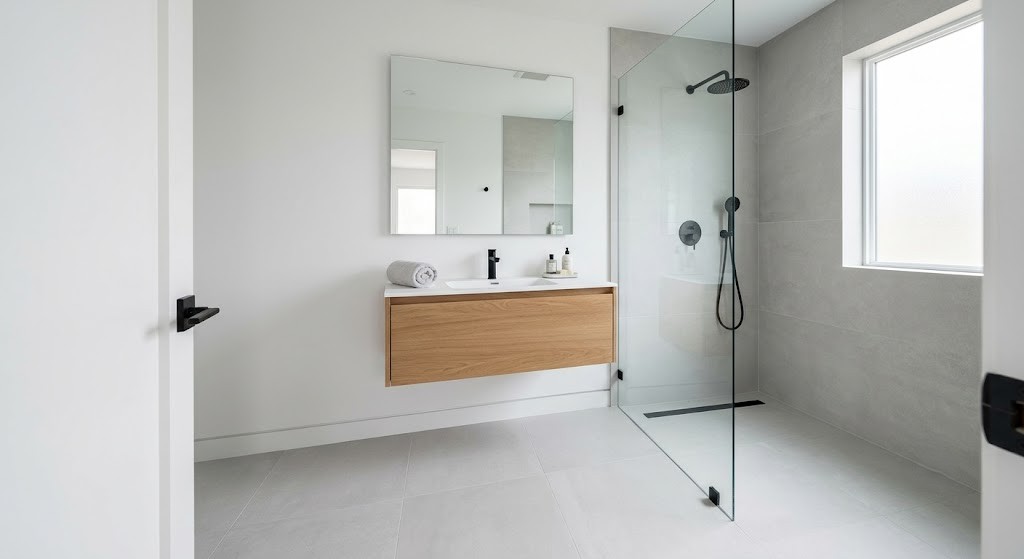
With the grid of joints removed from the equation, the floor no longer presents itself as a collection of fragments. It reads as one continuous surface stretching unbroken from wall to wall. Your eye travels freely across that surface, creating a perception of depth and openness that the room does not physically possess but convincingly projects.
Light Distribution and the Role of Recessed Joints
A less visible but equally important consequence of reducing joints involves how light interacts with the floor surface.
Grout sits slightly below the tile face in every installation, regardless of craftsmanship. Each joint creates a narrow channel that catches shadows differently than the smooth tile surrounding it. One channel casts an insignificant shadow. Hundreds of them together produce a cumulative darkening effect that is difficult to identify but easy to feel.
In rooms that depend entirely on artificial lighting — interior bathrooms, hallway kitchens without windows — this shadow accumulation dims the floor and, by extension, the entire room. The atmosphere feels heavier than the light output should warrant.
When oversized slabs reduce the number of joints from hundreds to a handful, that shadow effect nearly vanishes. The floor reflects light with far greater consistency. Corners brighten. The room lifts. No new fixtures or bulbs are needed — the improvement arises purely from a smoother, more reflective surface.
Escaping the Light-Color Orthodoxy
A well-established principle in interior design holds that small rooms should feature exclusively pale finishes. Light tile, soft paint, gentle surfaces — a formula built on the premise that bright tones visually expand a space.
The science behind this rule is sound. Lighter colors do recede, creating the impression that walls sit farther back than they actually do. But rigid adherence to this principle eliminates an entire spectrum of richer, more compelling color choices from consideration.
Large format tiles offer an exit from this constraint. Without the web of contrasting grout joints that typically intensifies dark surfaces, oversized pieces allow deeper, more saturated colors to occupy compact rooms without generating a claustrophobic atmosphere.
Picture a narrow half-bath with a floor composed of large dark tiles and grout selected to match. The surface reads as a single, unified dark mass — quiet, composed, and visually seamless. Set lighter walls above that dark base, and a natural hierarchy takes shape. The floor recedes as a visual anchor while the brighter walls pull the gaze upward. The ceiling appears to gain height, and the room achieves both depth and stability simultaneously.
A visit to a nearby ceramic tile shop makes this concept concrete. Handling oversized dark slabs and placing them beside lighter alternatives under actual lighting conditions reveals how dramatically the tone and scale affect spatial perception. Catalog images cannot replicate that experience.
Taking the Tile Onto the Walls
The most dramatic spatial transformation occurs when the same tile covers both the floor and the walls.
This technique has become a signature element of modern wet rooms and compact en suites. Using the identical 12×24 or 24×48-inch piece on every surface creates a continuous material envelope.
When grout lines transition from horizontal to vertical without any shift in alignment, your brain loses the landmarks it relies on to define a room’s boundaries. The corners where surfaces converge — the very points your mind uses to calculate spatial limits — fade into ambiguity. Without those reference markers, the room stops feeling like a box with measurable edges.
The result is a space that feels more like a carved-out volume than an enclosed area. The effect relies entirely on consistency. Any variation in tile, grout color, or surface finish between the floor and walls reintroduces the visual breaks that reestablish boundaries.
Installation Realities for Compact Rooms
The visual case is persuasive, but fitting large pieces into tight spaces involves practical considerations that differ from standard tile work.
Directional layout carries real consequences for the final result. In rooms with a clear long axis, aligning the long edge of each slab along that direction elongates the sight line. Your eye follows those extended lines deeper into the room, amplifying the sense of depth. Turning the tiles against that axis visually shortens the space.
Getting oversized slabs to the work area through narrow doorways requires advance planning. A 24×48-inch piece is heavy, rigid, and difficult to maneuver in confined access routes. Pre-cutting pieces to clear door frames before transporting them into the room prevents damage to both materials and surroundings.
Subfloor preparation becomes the difference between success and failure. Broad slabs transfer every imperfection in the substrate into stress concentrations within the tile. Before selecting products, consult with specialists at a ceramic tile shop about flatness specifications for your chosen dimensions. Self-leveling underlayment resolves most surface irregularities but must be applied correctly and allowed sufficient curing time.
Making Grout Disappear
Even with substantially fewer joints across the floor, the grout between remaining seams still shapes whether the design achieves its intended effect.
The objective is simple: make those joints invisible. Match your grout color to the tile as precisely as possible. When the two tones align, the joint lines vanish at normal standing distance. The floor presents itself as one uninterrupted surface — the visual condition that generates the perception of openness.
Contrasting grout achieves the opposite result. Pairing white joints with dark tile outlines every single piece and reasserts the grid pattern that large-format pieces were selected to eliminate. That outlining works well in spacious rooms where the grid becomes a design feature. In a tight room, it undermines the entire strategy.
For joints that remain visually subtle over extended periods, consider epoxy grout products. They resist discoloration and staining far more effectively than standard cement-based formulations. The installation demands greater precision and patience, but the payoff is a grout line that preserves its intended invisibility for years.
Starting Your Search
You do not need to expand a room to change how it feels. The floor alone carries the power to reshape spatial perception from the ground up.
Begin by exploring your options in person. A dedicated ceramic tile shop provides the opportunity to see oversized slabs at actual scale and compare them against traditional smaller formats. That side-by-side comparison eliminates abstract speculation and replaces it with immediate, tangible understanding.
Discuss your room’s dimensions, lighting conditions, and substrate requirements with knowledgeable staff before making decisions. Bring samples home and place them across your existing floor — the shift in how the room reads will be apparent within moments.
When paired with thoughtful preparation and informed material choices, large format tiles offer a practical, grounded method for transforming a room that feels restrictive into one that genuinely breathes. The evidence is visible, the principles are sound, and the result speaks for itself the moment you step across the threshold.